


Showing posts with label blog design. Show all posts
Showing posts with label blog design. Show all posts
New Blog Design Lauched for Keikolynn.com
Friday, August 10, 2012
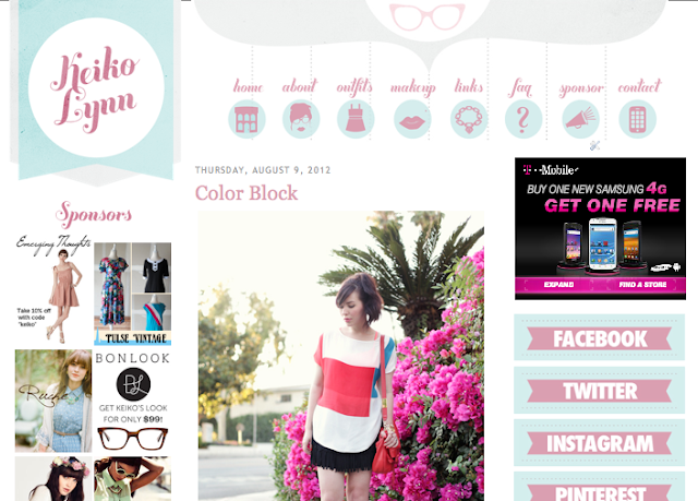
As we have been getting closer and closer to getting the new place settled and our new Massachusetts coastal life anchored in still waters, I too am getting caught up with blog design which has been tough ever since I took the offer for my new design day job. I was able to finally able to finish the design and development for Keiko Lynn. She was a pleasure to work with and incredibly nice. It took me much longer to get up than I had planned, but she was very understanding. Now that it is up I have been getting notifications of twitter interactions of her readers commenting on how much the like the new design. It always makes me happy when I get an email from a blogger to express their happiness with my work and is doubled up when I get so see the response of the readers. I finally was able to catch up on my gmail account and am finally going to take on some new projects. I definitely am scaling back on how many I am taking. I'm putting so much of myself into my new job and with all of the great family time I have been having in our 18th century little seaside town, I don't have as much of my schedule to devote to blog design. I'm hoping to get my rhythm back with posting and may have a fun announcement coming up soon. For now check out keikolynn.com and let me know what you think of the new design.

Last Minute Trip (New Office for a Week)
Saturday, February 25, 2012
So, next week we are going to Miami to visit Addy's Auntie and Uncle. It was a pretty last minute decision. Mommy and I packed up any weather appropriate clothes that we had. We decided that we needed to take a fun outing to buy Addy a whole new wardrobe, which I guess could be called vintage inspired tropical toddler chic : ) We had to pick up this bathing suit...


Well, I didn't get a whole new wardrobe, but I did get a travel case for my computer. Although this trip is going to be fun and games, I still have a tone of things to get done, so this guys new office is potentially going to look like the for the next week...
...although, I'm not so sure that I'll be able to get my imac set up on the beach. I'm not sure about getting power... maybe there is a balcony off of the hotel... maybe I should use the laptop...
But I digress.
This is going to be Addy's first time in Florida, and I haven't been there since last time I went there on tour... come to think of it, I don't think Rach and I have ever been there together. I must thank my brother Adam for housesitting for us while we are gone (sucker). Don't be surprised if some of the new designs this coming week have palm trees in them : ) until then, I thought I would share a new simple sleek blog design that just went up this week. It's a brand new domain and site for Jenn, so stop by and say hi. www.thefortunateplight.com
Blog Design Pointers 3
Tuesday, February 21, 2012
Today's pointers are going out to Michele from her new blog Short Girl, Long Island. She needed help with her new blog, she wasn't quite sure where to start or how to get certain things set up, so... this is what she is working with so far.
 My initial thoughts:
• She got everything set up and started posting, but it really almost look like an unfinished page, which can throw people off at first glance.
• I'm not a fan of having the Ads at the top of the sidebar. If you blog is new, just start building it up to the point that it can warrant having ads. Right now having text ads there almost gives it a vibe of a spam type thing.
• The colors and fonts end up feeling sterile.
• it's simple which can be good, but it just seems that it needs more.
Here are my pointers...

1. If the overall design is going to be simple and not graphic heavy, I would suggest having a nice clean font in the header and not have the background be too busy. The font that was used here is called Wisdom Script and can be found here.
2. I'm not a fan of script or handwritten fonts for the blog post titles. I would go with a cleaner legible font that is quick to read and find.
3. How about changing the body font to a medium gray? It give the overall feel a softer touch which comes across more pro looking.
4. I think you should have a profile image at the top of the sidebar that easily shows a little about you and is clickable to lead the reader to a page with an "about me" section. (Michele, write me through email if you would like this graphic).
5. I noticed that there is no navigation on your page. Navigation not only gives the reader more information and/or links to other social media for you, but it also gives visual interest to the overall design.
• She got everything set up and started posting, but it really almost look like an unfinished page, which can throw people off at first glance.
• I'm not a fan of having the Ads at the top of the sidebar. If you blog is new, just start building it up to the point that it can warrant having ads. Right now having text ads there almost gives it a vibe of a spam type thing.
• The colors and fonts end up feeling sterile.
• it's simple which can be good, but it just seems that it needs more.
Here are my pointers...
1. If the overall design is going to be simple and not graphic heavy, I would suggest having a nice clean font in the header and not have the background be too busy. The font that was used here is called Wisdom Script and can be found here.
2. I'm not a fan of script or handwritten fonts for the blog post titles. I would go with a cleaner legible font that is quick to read and find.
3. How about changing the body font to a medium gray? It give the overall feel a softer touch which comes across more pro looking.
4. I think you should have a profile image at the top of the sidebar that easily shows a little about you and is clickable to lead the reader to a page with an "about me" section. (Michele, write me through email if you would like this graphic).
5. I noticed that there is no navigation on your page. Navigation not only gives the reader more information and/or links to other social media for you, but it also gives visual interest to the overall design.
Blog Design Pointers 1
Tuesday, February 14, 2012
Judging by the influx of emails that I received last week, a lot of you are looking for a little help with the look of your blog. I have decided that I will be doing 2 per week (one Tuesday, one Friday), so keep checking back.


The first blog was submitted by Amy, She said, "I have a mom/family blog. I want a clean/ dreamy type look and I also just want something new". http://www.justanothermomday.blogspot.com/
My initial thoughts on the overall look of the blog are this:
•The title of the blog is very cute.
•There are too many non relating fonts.
•Needs more cohesive sidebar elements and spacing.
I have taken her ideas of a simple, dreamy type look and have these pointers...
1) For the header, to accomplish a more dreamy feel, I did a light cream overlay to make the photos have a softer feel and chose a cute script font called masana which can be downloaded here. If you like the header here, write me and I will send it to you.
2) Also, going with the concept of "dreamy" I've created a subtle background with a light blue/gray and translucent cloud overlay. I have added this to a new freebies download page which I will be adding more downloads to in the coming weeks.
3) I would suggest changing your sidebar navigation to be more cohesive with the rest of the overall look. This can be a good place to add some new colors, you just need to make sure it gels with the rest of the look. Also, I would suggest using a nice clean font to make it stand out and be very legible.
4) I think you need to have a consistent look with your social media icons. Refer to these two blogs that I have finished recently http://www.craftylittlegnome.com/ http://www.saturatedcanary.blogspot.com/
5) I've never been a fan of script or handwritten fonts involved in the content of a blog. I would suggest using a simpler clean font for the blog titles and info.
6) I noticed a strange look to your facebook widget, and I realized that the sizing doesn't match up with the sidebar that it is contained in (I think the widget is too big). Basically there are 2 ways this can be dealt with. Either you can make it more narrow so it fits inside the column, or you can make it span across both columns like the images above the sponsors section. Here is how you can adjust the size of that widget.
find the widget in your layout mode and locate this code.
<div class='widget-content'>
<script src="http://connect.facebook.net/en_US/all.js#xfbml=1"></script><fb:like-box href="http://www.facebook.com/pages/Just-Another-Manic-Momday/167914493226686" width="225" show_faces="false" stream="true" header="true"></fb:like-box>
</div>
as you can see the width="225" is stating that the width of that widget is 225 wide which is wider than that colum. You can adjust that number to be the width of that column and it will fit. OR, you can make it a larger number if you want to have it span both columns. ALSO, if you add height="anynumber" right after the width code you can add any number there to define the height of the widget...
I hope some of these ideas and pointers are helpful. Remember, the point of these posts is to help you get some ideas of how your blog can look better, please take some of my ideas and work on them and form them into your vision. I look forward to seeing what all of you come up with.
- Addy's Daddy.
Work it Out Part 2
Wednesday, February 8, 2012
So... we left off last week with me sending out the first draft. I wasn't 100% on it, but being the Brandilyn is such a sweet girl she said she loved it and the ideas. I had to step back and look at in in a couple of days and see what jumps out at me and what needs to be neutered (get it?) This is where we were...
 ... and here were my thoughts with fresh eyes.
• I'm not liking the layout of the header, I do like the feel and style, but it needs to be more balanced. It's just not a good use of that space. And I'm not crazy about the CAC logo, I think the idea is better than the execution.
• I think the idea of the orange sidebar is cool, I don't think it's going to fit this design.
• Adding an interesting but subtle background will do a lot for the overall feel and is doable now that I'm taking out the colored sidebar.
• Being that I'm going to add some hand drawn elements, I decided to make the buttons on the top hand drawn
• Add cat collar with tags hangin' off for social media links
• move the sidebar to the space between the buttons (my wife's idea)
• Oh my god Don, you are so clever... what about if there is a little simple hand drawn mouse that stays at the bottom right corner of the screen and as you scroll it moves down... brilliant, I tell you : )
I'm not sure if it's perfect, but it is much more appealing overall, we'll see how it sticks. This could be a keeper with just some more added embellishments.

• I'm not liking the layout of the header, I do like the feel and style, but it needs to be more balanced. It's just not a good use of that space. And I'm not crazy about the CAC logo, I think the idea is better than the execution.
• I think the idea of the orange sidebar is cool, I don't think it's going to fit this design.
• Adding an interesting but subtle background will do a lot for the overall feel and is doable now that I'm taking out the colored sidebar.
• Being that I'm going to add some hand drawn elements, I decided to make the buttons on the top hand drawn
• Add cat collar with tags hangin' off for social media links
• move the sidebar to the space between the buttons (my wife's idea)
• Oh my god Don, you are so clever... what about if there is a little simple hand drawn mouse that stays at the bottom right corner of the screen and as you scroll it moves down... brilliant, I tell you : )
I'm not sure if it's perfect, but it is much more appealing overall, we'll see how it sticks. This could be a keeper with just some more added embellishments.
Blog Design Pointers
Monday, February 6, 2012
So, I've decided to start a new little series here that will happen once a week. If you are in need of some ideas of how your blog design and layout could look better just email me a link to your blog with a little info about you and your blog to adelinesdaddy@gmail.com with a subject line of Addy Daddy Blog Pointers. I'm going to pick a blog or 2 each week and do a consult and post some images. Keep im mind, I'm not going to do the design and layout for you, but help guide you to do some changes on your own. Hit me up, I'm here to help.


Work it Out Part 1
Tuesday, January 31, 2012
When starting a new blog design there is an email that I always send that describes the process we will go through along with a set of questions so I can get some info to get the feel and personality of the blog (and writer). Today I'm starting a new series of posts chronicling the process of the design for the Sometimes Sweet/Adeline's Daddy giveaway winner Brandilyn and Cats and Cardigans. I'll start by showing the questions that I sent along with Brandilyn's answers, then I'll show you a little of the though process and finally the rough draft.
THOUGHT PROCESS

QUESTIONS / ANSWERS
•What is the title of your blog as you would like it top appear in the design?
cats & cardigans
•What is the title of your blog as you would like it top appear in the design?
cats & cardigans
• for your blog makeover, do you want to keep any elements from your current look?
not particularly...i'm pretty flexible when it comes to changing things up. i've designed my blog myself using picnik.com, paint, and googling "how to.." so it's kind of a hodge-podge mess right now.
not particularly...i'm pretty flexible when it comes to changing things up. i've designed my blog myself using picnik.com, paint, and googling "how to.." so it's kind of a hodge-podge mess right now.
• do you have a color palette that you are leaning toward / any color combinations that should be avoided?
I always love blues and greens (especially pea soup green or turquoise), although i really can't think of any color combos i wouldn't like (maybe pink...i generally don't do lots of pink). i like crazy color combos, and i also like subtle, muted palettes. so i guess whatever you think will look awesome, i'd probably be cool with!
I always love blues and greens (especially pea soup green or turquoise), although i really can't think of any color combos i wouldn't like (maybe pink...i generally don't do lots of pink). i like crazy color combos, and i also like subtle, muted palettes. so i guess whatever you think will look awesome, i'd probably be cool with!
• is there any imagery or elements that you would like to see involved?
I am a bit of a crazy cat lady, so i'd be pretty excited about something cat-themed in the header (or really, anywhere else on the blog).
I am a bit of a crazy cat lady, so i'd be pretty excited about something cat-themed in the header (or really, anywhere else on the blog).
• what are your favorite things about your current blog design?
I like that it's fairly simple, but once again, i'm not terribly attached to any one thing on the blog and i'm ready for some change.
I like that it's fairly simple, but once again, i'm not terribly attached to any one thing on the blog and i'm ready for some change.
• what are your least favorite things about your current design?
I have like 12 different fonts going on; i'd love a more streamlined look in that regard. i'd also love more color and a little more personality. it feels very vanilla and messy to me right now.
I have like 12 different fonts going on; i'd love a more streamlined look in that regard. i'd also love more color and a little more personality. it feels very vanilla and messy to me right now.
• do you have a list of blogs that you would like to reference for design inspiration?
I scrolled through the "blog design" section on your blog, and seriously, i love all the blogs you've redone. my favorites are probably the Paper Mama, Small House by the Sea, and Nice Girl Notes.
I scrolled through the "blog design" section on your blog, and seriously, i love all the blogs you've redone. my favorites are probably the Paper Mama, Small House by the Sea, and Nice Girl Notes.
• Is there anything special that you would like to add to your blog that isn't there already? Like buttons, links, navigation.
I'd love a nice, organized way to get to my twitter, pinterest, etc., similar to what you did for Nice Girl Notes (i love the little buttons).
I'd love a nice, organized way to get to my twitter, pinterest, etc., similar to what you did for Nice Girl Notes (i love the little buttons).
• Please include anything else (including photos) that you think would also be useful.
I've attached the picture i have in my "about" button thing at the top right of my blog right now. i like that one to have on the blog as a "hello" kind of thing, although it definitely doesn't have to be as big as it is now.
I've attached the picture i have in my "about" button thing at the top right of my blog right now. i like that one to have on the blog as a "hello" kind of thing, although it definitely doesn't have to be as big as it is now.
I started by looking at her current blog to see what she has going right now and to reference her notes against it. IT's not offensive, kinda cute, but I do agree there isn't a cohesive feel to it. I see we have a cute stylish type and also a self proclaimed "crazy cat lady" so I'm envisioning so cool fabrics, sewn buttons, and of course some cat themed graphics. I don't want the cat themed aspect of it to overwhelm the overall feel or make it look frumpy, so I want it to be more subtle and mostly in the accents. So, here is the sketch I put together and the notes.
• The top section will be a fabric that is almost like a sideways button up sectioning off the header with fabric patches sewn on for the navigation and logo.
• The logo patch will be something similar to the sketch with an "&" symbol in cat nose with whiskers to the sides.
• there will be one sidebar to the right of the content, with a background color that goes top to bottom of the blog.
• for sections in the sidebar I'm thinking that sound cool cat oriented accents like a cat collar that wraps around it with cat tags hanging that will contain the social media links. Also other collars with bells.
• This is just the rough, so let me know if you liking it and I will do some more elaboration. Keep in mind that the Sometimes Sweet site started here and ended here.
QUICK COMPUTER MOCK
• Here is a mock of the feel and colors I was thinking.
...next week, adjustments and reworks...
Designing for Bloggers.
Saturday, January 28, 2012
Lately I feel lucky, to be working from home doing something I love and being able to be near my wife and daughter all day... I'm not sure what I did to deserve this. Along with a ton of great projects, I am really enjoying meeting new people. When I do a full blog design for someone I really get to know the person in a way that I don't get with other design projects that I do. Ultimately I need to translate my impression into an online representation of them and their chronicling of life as they see it.
Earlier this month I was stoked to giveaway a free blog makeover with Danielle from Sometimes Sweet (I did her blog design, and it was one of my favorite designs I've ever done, and it didn't hurt that she is such a rad girl to deal with) The winning blog was Brandilyn and Cats and Cardigans. I've decided to share this process with you, you can consider this like a HGTV show but instead of me redoing her kitchen... I'm going to be putting in a granite counter top on her blog (not literally). So far she seems like a super sweet nice girl, I'm going to enjoy learning more about her. (posts coming early next week)
On the topic of blog designs, I finished up a couple this week, and I'm liking the way they turned out. It was great working with/ getting to know Krista and Samantha. I'm even starting another design for Krista's art blog soon. Check out their blogs, let me know what you think.

Pin It Full blog can be seen here

It's So Much Harder Doing Things For Yourself.
Wednesday, January 11, 2012
So, I have recently decided that I'm going to throw a new site/blog design project into my already packed schedule for myself. I've neglected mine whilst working on other sites every day. I'm realizing that it can be hard to visualize what you want to have made, especially when you are the maker. When I get a new client and send them out my questionnaire and get it back filled out nicely with direction, ideas, color schemes and personalty profile it makes it a lot easier for me to detach my personal expectations of what I want to end up with and think of what my client wants to end up with (with my interpretation and touch).
Taking on the role of the designer and client makes me really appreciate the people I have worked with over the years, because in some ways I am a terrible client. So, thanks goes out to everyone that I have worked with that have made what I do so enjoyable, because I know that it isn't easy. I hope to get my new sites up some time in the next month, including a new blog and a new design site. For now, here are a couple of rough drafts. We'll see how many times I change my mind.


Taking on the role of the designer and client makes me really appreciate the people I have worked with over the years, because in some ways I am a terrible client. So, thanks goes out to everyone that I have worked with that have made what I do so enjoyable, because I know that it isn't easy. I hope to get my new sites up some time in the next month, including a new blog and a new design site. For now, here are a couple of rough drafts. We'll see how many times I change my mind.
Start of the design site..

Start of the blog feel...
The Process: Concept
Friday, December 16, 2011

New Designs & Giveaway winner
Monday, December 5, 2011
So, I finished up a couple more blogs last week, I'm almost getting caught up now : ) If you are in need of a new look I'm ready for you. It was fun working on these projects with Suzanne and Kim and getting there new look just as they want it. I've heard good things from them, and that is what I'm aiming for, I'm not trying to make a statement, I want them to have the look they want. Check out their blogs, they are both pretty great, one you would even say... is pretty swell.


Click here to check out Suzanne's full blog
Click here to visit Kim's full blog
ALSO, I need to pick a winner for the last Tea With Dads giveaway. After a 1-2-3 choice from my wife, the winner is Sara from Sarbear's Journey
Design Update
Monday, November 14, 2011
I have had a pretty busy design schedule lately. I was very excited to get the new Sometimes Sweet design done and up a couple of weeks ago and last week I had a couple more blog designs go up. I already have my schedule just about filled, but it is great to have worked on something and finally see it up live. Especially when about a month and a half ago the SS design was just a sketch in my composition book. (see below)

From this sketch, I worked it out... and ended up here...


I went to a talk give by Michael Bierut regarding his use of composition notebooks over his 30 years of design. It was an amazing presentation, I left there very inspired. The next day I bought 5 composition pads and have been sketching everything out in them since. From blog layouts, to a new desk that I built, to Tea with Dad's interview questions, the pages are filling up fast.
 I wish I had started using them when I started nearly eight years ago... I guess better late than never. I'm going be excited to pass these down to Addy some day as a record of what her Daddy spent most of his days doing. I'm sure I will enjoy looking back someday as well.
Here are a couple of new finished designs that started in my composition book.
 Full blog can be seen here
Here are a couple of new finished designs that started in my composition book.
Full blog can be seen here Full blog can be seen here
I will probably be sharing some more from sketch pad to finished design soon.
Building Stuff (in my house and online)
Monday, October 31, 2011
Today was the beginning of the end for a couple of big projects that I have been working one. On Wednesday we are getting a fireplace insert put in a spot where I had taken down a mantle (see previous post) and I have prepping the spot for about a month. Today it was replacing floors near where the new mantle will be. First I had to cut out the old floor and get it cut nice and straight for the faux hearth.


Luckily Addy and my Wife are at Grammy's house tonight. Rach would not be too happy with the extreme mess that is going on in our house today. But, the long day of work felt good when the floors actually turned out great.
Now that I have some aches from my "This Old House" day. It's time to finish something up that I have also been working on for a little over a month. Time to hit the computer to build the new Sometimes Sweet Blog. I have everything designed and approved and ready to go up, so this may be a long night. I want to get it totally live tonight. I am really stoked to get this up and have all of you check it out. For now I'll give you a tiny taste.
Design Giveaway Winner!
Wednesday, September 21, 2011
The winner of the blog design giveaway was just announced over at It's a Wonderful Life. Head over to see if you've won.

Giveaway with It's a Wonderful Life
Saturday, September 3, 2011

If you haven't seen yet, one of my favorite blogs is doing a design giveaway by Adeline's Daddy (hey, that's me). Head over to It's a Wonderful Life to check it out and enter. And while you are there, make sure you check out what's going on in the world of Allie, Henry & Garrison. Thanks so much to Allie for working on this with me... can't wait to see who wins. Attention future winner, It's going to be fun working with you on your blog... would you like fries with that?
Reposition Gadgets on Blogger using CSS
Saturday, August 27, 2011
So, today I've decided to share a little trick for moving around gadgets on Blogger, which can be super helpful when you are working on fine tuning the design of your blog... or if you want to add something a little special (like the hearts logo with angled banner that trails off the page at the top left of my blog). I'm going to try to present this in the easiest way possible, and hopefully it will be useful to you.
First, find the gadget name:
•In the design screen right click on "edit" located to the bottom right of the gadget you would like to adjust and open in a new window.

•In the address bar there will be an address similar to this http://www.blogger.com/rearrange?blogID=3833409852568378890&widgetType=HTML&widgetId=HTML4&action=editWidget§ionId=sidebar-right-2-2
what you are looking for is the widgetId name which I have bold.
Next you are going to go to template designer/ advanced/ Add CSS
•in the white box you will add this CSS and adjust (instructions for options are below)
 #HTML4{
position:relative;
left:0px;
top:0px;
}
••#HTML4 - this will be the name of the gadget as we found in the first step (make sure you keep the #)
••position: - this option relates to where to position originates. Being that we are just doing a reposition, we are going to use "relative" because it moves the gadget in relation to where it originally is on your blog.
••the left and top options are what you use to move the gadget. You can put a positive or negative number in there to move it left to right and top to bottom. You can mess with the numbers which in the "add CSS" box and adjust values until you get it where you want it.
•If you would like to move multiple gadgets uniformly, you can add multiple IDs separated by a comma. like this:
If you have ever been troubled by the space between your posts content and your header, you can use this CSS to move your content up closer to your header buy using this code just like we just did for the gadgets.
#Blog1{

First, find the gadget name:
•In the design screen right click on "edit" located to the bottom right of the gadget you would like to adjust and open in a new window.
•In the address bar there will be an address similar to this http://www.blogger.com/rearrange?blogID=3833409852568378890&widgetType=HTML&widgetId=HTML4&action=editWidget§ionId=sidebar-right-2-2
what you are looking for is the widgetId name which I have bold.
Next you are going to go to template designer/ advanced/ Add CSS
•in the white box you will add this CSS and adjust (instructions for options are below)
position:relative;
left:0px;
top:0px;
}
••#HTML4 - this will be the name of the gadget as we found in the first step (make sure you keep the #)
••position: - this option relates to where to position originates. Being that we are just doing a reposition, we are going to use "relative" because it moves the gadget in relation to where it originally is on your blog.
••the left and top options are what you use to move the gadget. You can put a positive or negative number in there to move it left to right and top to bottom. You can mess with the numbers which in the "add CSS" box and adjust values until you get it where you want it.
•If you would like to move multiple gadgets uniformly, you can add multiple IDs separated by a comma. like this:
#HTML4, #BlogArchive1, #Followers1, #HTML3{
position:relative;
left:0px;
top:0px;
}
If you have ever been troubled by the space between your posts content and your header, you can use this CSS to move your content up closer to your header buy using this code just like we just did for the gadgets.
#Blog1{
position:relative;
left:0px;
top:0px;
}
I just thought I would share this quick, I hope it is helpful. If you need blog help, contact me, and check out my blog design service.
Subscribe to:
Posts (Atom)